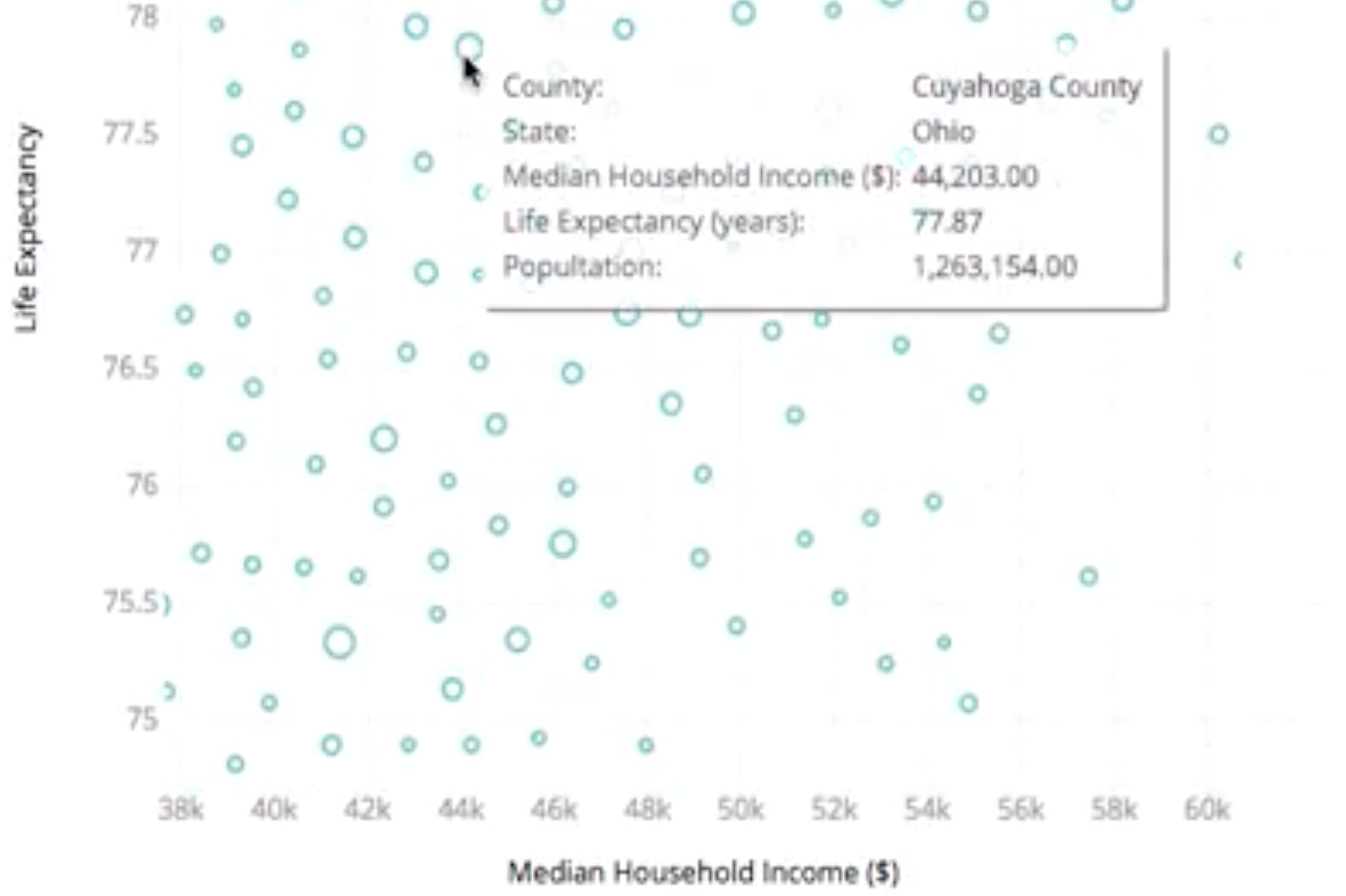

3 questions to ask yourself next time you see a graph, chart or map
Visualizations can help you understand data better – but they can also confuse or mislead. Here, some tips on what to watch out for.
Carson MacPherson-Krutsky, PhD Candidate in Geosciences, Boise State University •
conversation
July 24, 2020 • ~8 min
July 24, 2020 • ~8 min
Academics without borders | MIT News
Senseable City Lab visualizes 20 years of data to show how students, faculty, and scholars join MIT from all over the world.
School of Architecture and Planning
• mit
June 14, 2017 • ~3 min
June 14, 2017 • ~3 min
Real estate innovation by the numbers | MIT News
Real Estate Innovation Lab to promote the future of urban development by showing investors how it can work.
School of Architecture and Planning
• mit
Nov. 3, 2016 • ~8 min
Nov. 3, 2016 • ~8 min
Mapping coal’s decline and renewables' rise | MIT News
CoalMap online tool shows what policy regulations and technological advancements can do for the cost-competitiveness of solar and wind energy.
Francesca McCaffrey | MIT Energy Initiative
• mit
June 22, 2016 • ~6 min
June 22, 2016 • ~6 min
How to make better visualizations | MIT News
Eye-tracking research reveals which types of visuals actually get the message across.
Adam Conner-Simons | CSAIL
• mit
Nov. 5, 2015 • ~7 min
Nov. 5, 2015 • ~7 min
/
1