Canadian_Journey_Series
Canadian Journey is the sixth series of banknotes of the Canadian dollar designed and circulated by the Bank of Canada. It succeeded the 1986 Birds of Canada banknote series. The first banknote of the Canadian Journey series issued into circulation was the $10 bill on 17 January 2001, and the last to be issued was the $50 bill on 17 November 2004. The series was succeeded by the 2011 Frontier Series, the banknotes of which were first issued into circulation from 2011 to 2013.
This series introduced new security features and discontinued the use of planchettes, a security feature common since the earliest Canadian banknote series. All banknotes have tactile features to assist people who have visual impairments to identify the notes.
Designs on the reverse of each banknote in the series were based on themes of fundamental Canadian values and achievements. The $20 banknote was awarded 2004 Banknote of the Year by the International Bank Note Society.
The Bank of Canada began the process for a banknote series to replace Birds of Canada in 1997[1] by establishing a currency development team.[2] It faced several constraints, including the use of a more secure substrate, addressing increased counterfeiting, improving accessibility for those with visual impairments, and ensuring a financially feasible production because of budgetary constraints.[2] The Ministry of Finance was involved in the design process, providing ideas for banknote themes for the series.[3]
The formal design of the banknotes began in 1998[2] and was performed by a team led by art director Jorge Peral at the Canadian Bank Note Company, which also had members from the British American Bank Note Company.[4][5] The team created model designs that were reviewed by focus groups.[4] The Bank of Canada had considered using portraits of famous Canadian artists and inventors, instead of those of the Queen of Canada and former prime ministers, but ultimately rejected the idea at the request of Jean Chrétien, who preferred the familiar portraits.[4]
Early prototype designs included prominent portraits and vignettes of parliamentary buildings similar to those of the final design.[5] The reverse of each denomination featured an animal indigenous to Canada in vertical portrait orientation. The set of themes that would ultimately be chosen had to adhere to modern banknote security design principles and "reflect fundamental values recognized and cherished across the country".[4] These values included Canadian culture, diversity (for example multiculturalism), achievements, and that the concepts could be rendered artistically.[4] Two elements of the design would not be changed: the portraits featured on each denomination and the dominant colour for each denomination, both of which were to be the same as those for the respective denomination in the Birds of Canada series.[6]
It was the first time the Bank of Canada involved the public in the design process for a banknote series, conducting telephone surveys in 1997 to obtain public opinion about design themes and selecting individuals to participate in focus groups to review design selections.[3][2] Children throughout Canada submitted designs to the Bank of Canada via their elementary schools, and over 4,000 Canadians participated in the design process.[3]
All banknotes in the series feature a stylised Flag of Canada in the upper right-hand corner of the obverse,[7] and measured 152.4 by 69.85 millimetres (6.000 by 2.750 in).[8] Each banknote also included an excerpt from literary works reflecting the denomination's theme.[9]
Because of the increasing proliferation of affordable consumer colour photocopiers, inkjet printers, and scanners, the security features of Birds of Canada was becoming increasingly easier to circumvent.[10] As a result, the Bank of Canada undertook development of the Canadian Journey Series, during which time it also developed a new anti-counterfeiting strategy.
In addition to improving the security of the substrate and the integration of security features in the banknote designs, the Bank of Canada also launched a public education campaign, actively deterred counterfeiting by closer collaboration with law enforcement, and accelerated the removal and destruction of banknotes from older series from circulation.[11][12] Moreover, it actively discourages financial transactions using banknotes from older series.[13]
Substrate
In the mid 1990s, the Bank of Canada tested a new substrate, named "Luminus"[14] and produced by Domtar, for use in printing banknotes.[15] It printed 100,000 experimental $5 banknotes, using the Birds of Canada design, having a substrate of polymer core between two layers of cotton paper.[16][15] The notes were issued into circulation, and the test found "no major problems" with the substrate.[14] It was chosen as the substrate for the $5 and $10 banknotes in June 1998 and for all other denominations in September 1999.[14] In December 1999, the manufacturer withdrew its offer to supply the substrate because of technical production issues and its market viability.[14] The Bank of Canada found a cotton fibre substrate with "characteristics similar to those of Luminus" on which to print the $10 banknote it would issue in January 2001 and later for the $5 banknote issued in March 2002.[14] The similarity of the substrate to Luminus would enable a transition to it once production issues were resolved, as the Bank of Canada had acquired Canada-wide rights to the substrate and continued to develop it,[14] but the project was ultimately discontinued in 2002.[16][15] As a result, the Bank of Canada chose to use the standard watermarked paper, but required suppliers to include a "windowed metallic thread" in the substrate.[15]
Features
Incorporating the desired security features into the design was a "challenging aspect of the design process".[4] These features included: intaglio printing, such as the raised ink in some numerals; microprinting, such as in the descriptions adjacent to the building vignettes on the obverse of each banknote; a holographic stripe adjacent to the portrait, with iridescent maple leaves shifting from a matte to shiny gold when tilted; a watermark of the portrait and denomination's value in an empty space near the building vignettes; a see-through number with disjoint components appearing as a complete numeral when viewed with background lighting; a colour-shifting thread embedded on one side of the banknote, on which is printed the banknote's denomination; and features visible when exposed to ultraviolet light.[15][17]
Features implemented with raised ink on the obverse of each banknote include the large numeral at the bottom right, the shoulder of the portrait, and the words "Bank of Canada" and "Banque du Canada" in a vertical stripe to the left of the holographic metallic strip.[18] A genuine banknote from this series will not fluoresce when exposed to ultraviolet light except for the coat of arms and the words "Bank of Canada", "Banque du Canada", "Ten", and "Dix" over the left portion of the portrait.[19] Randomly distributed white security fibres embedded in the substrate will glow red.[20]
When a banknote is backlit, the "ghost-like" portrait in the watermark will become visible and the colour-shifting thread is revealed as a set of windows along a continuous line that shift colour when tilted.[21] The maple leaves on the holographic metallic strip appear to move when the note is tilted, and each is split by a colour change.[21]
The series also excluded former security features, such as the planchettes, green dots randomly occurring on the surface of the banknotes.[15] Planchettes were replaced by coloured fibres embedded in the paper that fluoresce when exposed to ultraviolet light.[15]
Each banknote features the EURion constellation.[22] On the obverse, the pattern occurs in a band between the portrait's shoulder and the signatures of the Governor of the Bank of Canada and deputy governor in the lower right of the banknote.[22] All but the $50 banknote also contain several instances of the constellation on the lower portion of the building vignette at the centre of the banknote.[22] On the reverse, the $5 and $10 banknotes have a visible plain yellow EURion constellation pattern. The pattern is "clearly identifiable" on the $20 and $100 banknotes, which encloses each dot of the constellation in a blank circle.[22] On the $50 banknote, the pattern is nearly undetectable, as a pattern of fine red lines masks the yellow dots; these are revealed when viewing the blue channel of a digital image of the banknote.[22]
The Bank of Canada began investigating integration of accessibility features into banknotes with the passage of the Canadian Human Rights Act in 1977.[23] Its research indicated that Braille was not a viable option, as not all visually impaired individuals are able to read it, and denominations of different sizes are not financially viable.[23] It thus chose to develop features that could be identified by a banknote reader, which it implemented in the Birds of Canada series.[23]
For the Canadian Journey Series, the Bank of Canada and the Canadian National Institute for the Blind held consultations with "experts in the fields of vision and tactility perception",[1] during which several desirable features were identified.[23] The Bank of Canada concluded that accessibility features should enable an individual to identify a banknote's denomination "quickly, independently, privately, and with the note in any orientation" and that it should implement features assisting individuals with a range of vision impairments.[1] It again rejected denominations having banknotes of different size for being inconsistent with the use of banknote processing equipment[24] such as automated teller machines, vending machines, self checkout machines, slot machines, ticket and parking lot machines, and note sorting equipment.
This series was the first issued by the Bank of Canada to incorporate a tactile feature to allow individuals with visual impairments to determine a banknote's denomination.[15] This takes the form of Braille blocks consisting of six dots arranged in two parallel columns, each denomination having a different pattern of blocks, placed on the top right-hand corner when facing the obverse. The feature was developed by the Canadian Bank Note Company, which collaborated with Queen's University tactility perception expert for symbol design.[24] It produced 48 sample designs, of which six were selected for final consideration based on tactility, production techniques, and banknote thickness.[24] These were tested with collaboration of the Canadian National Institute for the Blind and the Canadian Council of the Blind by individuals with functional blindness.[23][24] The feature was considered appealing as it did not require individuals to use assistive technology in order to identify a banknote's denomination.[24]
The colour for each banknote denomination was updated to enable individuals to more easily distinguish between them, particularly the brown of the $100 banknote and the red of the $50 banknote, along with the purple of the $10 banknote and the blue of the $5 banknote.[23] The design of each denomination also included large, high-contrast numerals and a barcode, each identifying the respective denomination.[15] The numerals were about 30% larger than in the Birds of Canada series and were chosen after testing conducted by vision experts at the University of Waterloo.[24]
The electronic banknote reader distributed for Canadians requiring assistive technologies was also updated to be able to scan and identify these banknotes,[15] and was half the size and weight than that used for the Birds of Canada series.[24] It was also improved by adding tone and vibration output modes in addition to the speech synthesis voice output of the earlier model.[24] Its development cost about CA$500,000.[25]
Approximately 3% of a banknote's production cost is associated with the tactile feature.[25]
| Value | Main colour | Obverse | Reverse | Issued[8] | Withdrawn |
|---|---|---|---|---|---|
| $5 | Blue | Wilfrid Laurier | Children playing hockey, tobogganing, and skating; excerpt from "The Hockey Sweater" by Roch Carrier | 27 March 2002 | 15 November 2006 |
| 15 November 2006 | 7 November 2013 | ||||
| $10 | Purple | John A. Macdonald | Peacekeeping forces and war memorial; poppy field and excerpt from "In Flanders Fields" by John McCrae | 17 January 2001 | 18 May 2005 |
| 18 May 2005 | 7 November 2013 | ||||
| $20 | Green | Elizabeth II | Artwork of Bill Reid and an excerpt from Gabrielle Roy's novel The Hidden Mountain | 29 September 2004 | 7 November 2012 |
| $50 | Red | William Lyon Mackenzie King | The Famous Five and Thérèse Casgrain; quotation from the Universal Declaration of Human Rights | 17 November 2004 | 26 March 2012 |
| $100 | Brown | Robert Borden | Maps of Canada and an excerpt from Miriam Waddington's poem, "Jacques Cartier in Toronto" | 17 March 2004 | 14 November 2011 |
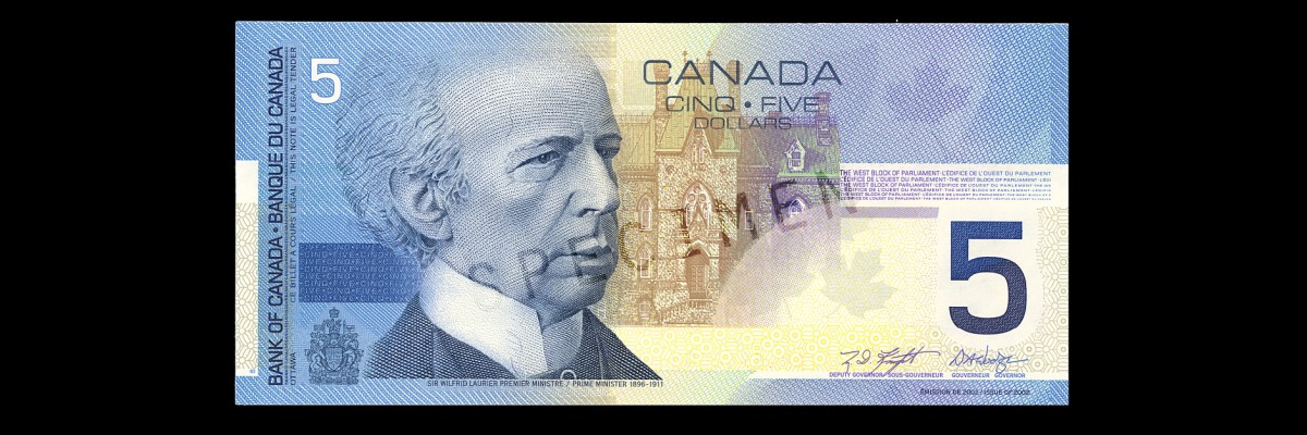
$5 note
The theme chosen for the $5 banknote was "children at play".[4] The banknote was the second issued in the series and was first circulated in March 2002.[7] An updated version of the $5 denomination banknote, incorporating the security features introduced in the higher-denomination banknotes of this series, was issued in November 2006.[26]
The obverse has a portrait of Wilfrid Laurier, the engraving for which was created by Czesław Słania.[7] The building depicted at the centre is a vignette of the West Block of Parliament Hill.[7]
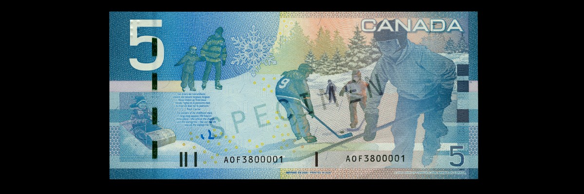
The reverse features a depiction of the banknote's theme, with images of children tobogganing, skating, and playing hockey on a frozen pond.[7] Below a white snowflake near the middle of the banknote is an excerpt from "The Hockey Sweater" by Roch Carrier.[20] It and the $10 bill were the last of the Canadian Journey banknotes to be printed, with printing ceasing in November 2013.
$10 note
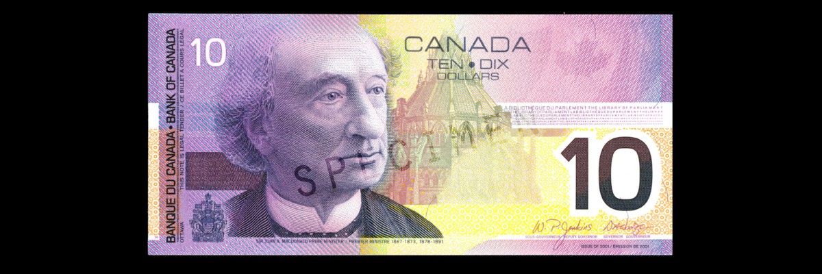
The theme chosen for the $10 banknote was "remembrance and peacekeeping".[4] The banknote was the first issued in the series and was first circulated on 17 January 2001.[27][28] An updated version of the $10 denomination banknote, incorporating the security features introduced in the higher-denomination banknotes of this series, was issued in May 2005.[26]
The obverse has a portrait of John A. Macdonald, the engraving for which was created by Peral.[29] The vignette at the centre is the Library of Parliament building.[28]
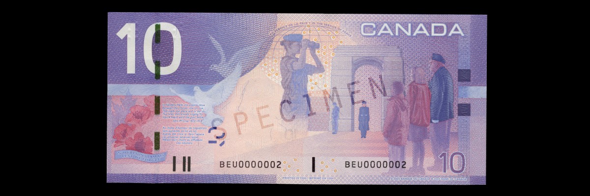
The reverse features a depiction of the chosen theme. Standing in front of a large cenotaph in the background are a female Royal Canadian Navy officer and a male Canadian Army master corporal, and in the foreground are two children with Canadian Armed Forces veteran Robert Metcalfe observing Remembrance Day.[28][30] In the centre is a female Royal Canadian Air Force officer depicted in peacekeeping duties[28] wearing a combat uniform and blue beret. Adjacent to the officer are white doves in flight and the phrase "In the service of peace".[31] In the lower left corner are red poppies superimposed on a maple leaf, beside which is an excerpt from "In Flanders Fields",[28] a war poem in the form of a rondeau written by John McCrae during World War I that is now a Remembrance Day icon.[32] Underneath it is an equivalent excerpt from "Au champ d'honneur", the French translation of the poem written by Jean Pariseau.[28] The text of the poem was obtained from a manuscript hand-written by McCrae stored at Library and Archives Canada.[27] Red poppies became a symbol of remembrance for war dead because of McCrae's poem.[27] It and the $5 bill were the last of the Canadian Journey banknotes to be printed, with printing ceasing in November 2013.
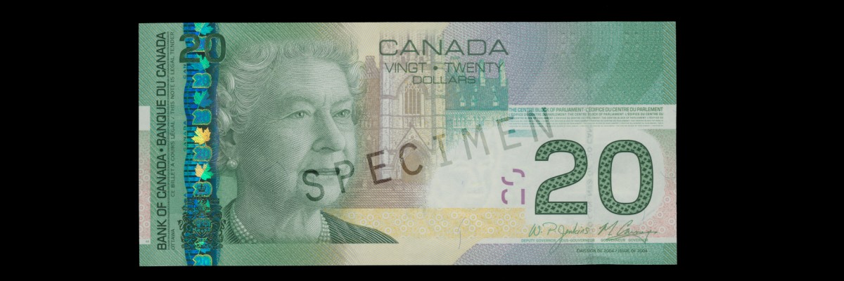
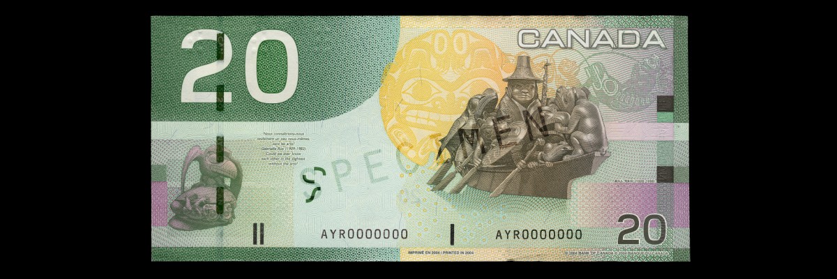
$20 note
The theme chosen for the $20 banknote was "arts and culture".[4] The banknote was first circulated in September 2004.[33]
The portrait's engraving on the obverse was created by Peral based on a photograph of Elizabeth II taken by Charles Green in 2000.[34] The photograph was taken specifically for rendering an image on this banknote, which appears next to a vignette of the Centre Block of Parliament Hill.[33]
The reverse depicts the chosen theme using illustrations of artwork created by Bill Reid, an artist of maternal Haida heritage from which he draws creative inspiration.[33] To the far left is an illustration of The Raven and the First Men, a laminated yellow cedar sculpture housed at the Museum of Anthropology at the University of British Columbia, adjacent to which is an excerpt from the 1961 book La Montagne secrète by Gabrielle Roy and its English translation by Harry Binsse.[35][33] To the right is a prominent illustration of the sculpture Spirit of Haida Gwaii, with a yellow-toned background depicting the ceremonial drum sculpture Haida Grizzly Bear.[35] In the upper right-hand corner is an illustration depicting the sculpture Mythic Messengers, an 8.5 metres (28 ft) bronze frieze now installed at the Bill Reid Gallery of Northwest Coast Art.[36]
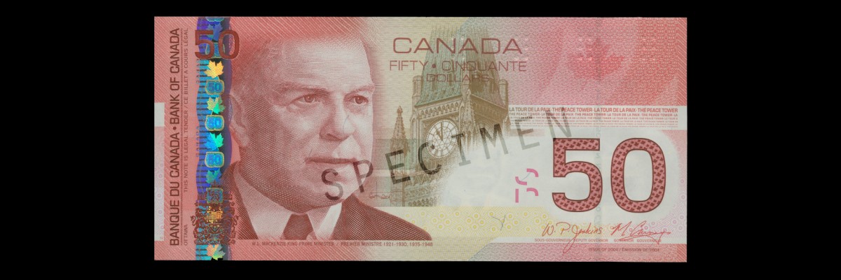
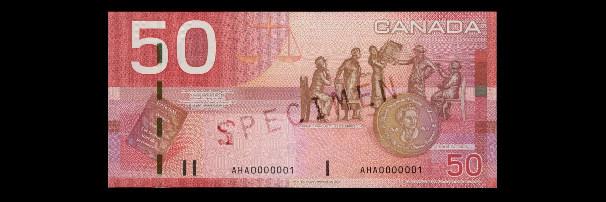
$50 note
The theme chosen for the $50 banknote was "nation building".[4] The banknote was first circulated in November 2004 and was the last of the Canadian Journey banknotes to be introduced.[33]
The obverse portrait is of William Lyon Mackenzie King created using a computer-assisted engraving process by Giesecke & Devrient.[33] The central vignette depicts the Peace Tower on Parliament Hill.[33]
The reverse features an illustration of the statue of the women known as The Famous Five fronted by an illustration of the Thérèse Casgrain Volunteer Award medallion honouring Thérèse Casgrain.[33] The text excerpt included on the left-hand side is a quotation from the Universal Declaration of Human Rights, the first draft of which was composed by Canadian human rights advocate John Peters Humphrey.[33]
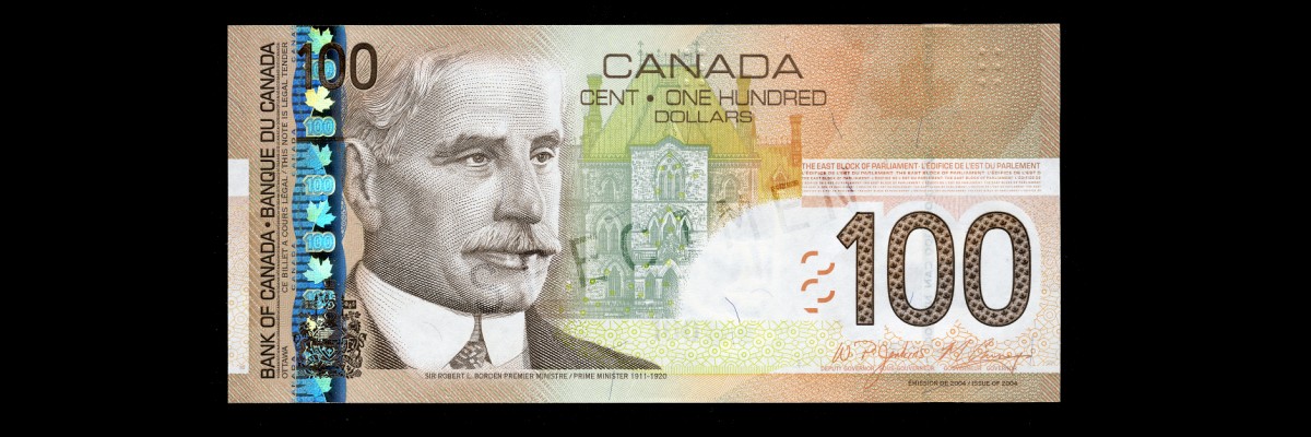
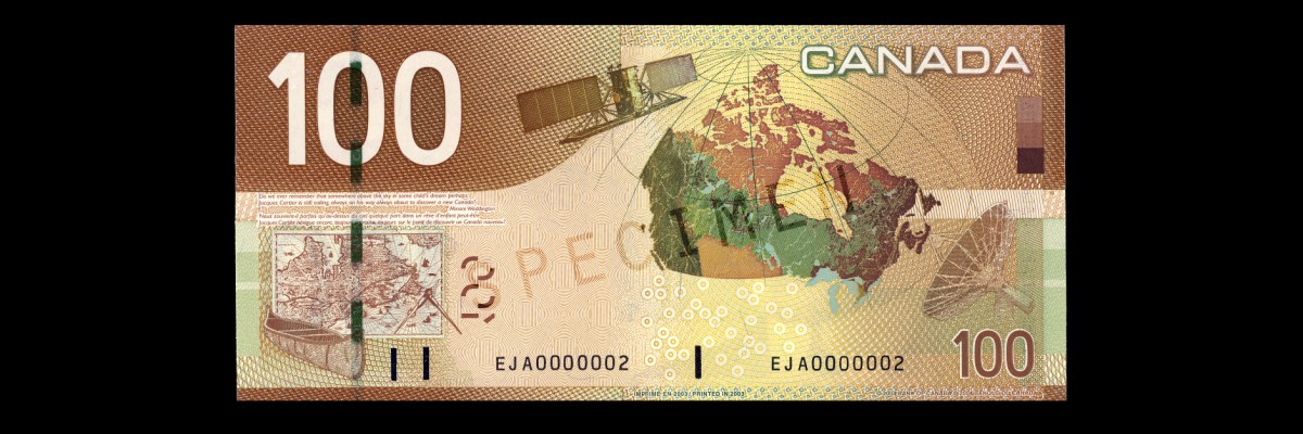
$100 note
The theme chosen for the $100 banknote was "exploration and innovation".[4] Its design involved input from seven separate sources, among them Natural Resources Canada, the Canadian Space Agency, the National Archives of Canada, and the Canadian Canoe Museum.[9] The banknote was first circulated on 17 March 2004.[37]
On the obverse is a portrait of Robert Borden, based on a watercolour by Peral, engraved by Czesław Słania.[38] The vignette at the centre is of the East Block of Parliament Hill.[38]
On the reverse is a depiction of the chosen theme featuring Canadian achievements in cartography and communications.[38] In the lower left-hand corner is an illustration of a birch bark canoe and a 1632 map of New France by Samuel de Champlain, above which is a quotation from the poem Jaques Cartier in Toronto by Miriam Waddington and a French translation by Christine Klein-Letaud.[38] To the right is a satellite image of Canada, with an illustration of Radarsat-1 to its left and a communications antenna to its right.[38]
Canadian Journey Series banknotes differ based on the date they were printed. Other than the change to the $5 and $10 banknotes to update their security features, the most notable change is the combination of signatures of the Governor of the Bank of Canada and the Deputy Governor occurring on the banknotes, which were updated with every change to the executive of the Bank of Canada. The following signature combination banknotes were released:[8]
| Governor | Deputy governor | Years of printing | Denominations |
|---|---|---|---|
| Gordon Thiessen | Malcolm Knight | 2001 | $10 (2001) |
| David Dodge | Malcolm Knight | 2001–2003 | $5 (2002), $10 (2001) |
| David Dodge | Paul Jenkins | 2003–2008 | $5 (2002, 2006), $10 (2001, 2005), $20, $50, $100 |
| Mark Carney | Paul Jenkins | 2008–2010 | $5 (2006), $10 (2005), $20, $50, $100 |
| Mark Carney | Tiff Macklem | 2010–2013 | $5 (2006), $10 (2005), $20, $50, $100 |
Canadian Banknotes were printed by two different security printers until 2011: the Canadian Banknote Company and BA International Inc. The serial number prefix indicates which printer was responsible for printing the particular banknote.
The first two banknotes issued in the series introduced three security features new to Canadian banknotes.[14] These were the hidden number to the left of the portrait, the iridescent maple leaves, and the fluorescent features (embedded fibre and images over left side of the portrait).[14] These features did not deter counterfeiting.[14]
In 2003, high-quality counterfeits of the $10 banknote appeared in circulation in Ontario and Quebec.[39] In May 2006, Peel Regional Police in the Greater Toronto Area seized $50,000 worth of $20 and $50 counterfeit banknotes and received assistance from the Integrated Counterfeit Enforcement Teams division of the Royal Canadian Mounted Police to search for the production plant, which had created counterfeit banknotes with a total face value over $1,000,000.[40] In the spring of 2008, a batch of counterfeit $100 appeared in the Greater Toronto Area.[41] Reaching a peak distribution there in May, similar forgeries were later found in the Montreal area, with its peak distribution in June.[41]
In 2004, Canada had a counterfeit ratio of 470 parts per million, which decreased to 133 parts per million by 2007.[42] The banknotes in the series with the holographic metallic stripe were counterfeited by "well-organized, well-financed groups" having the resources and time to replicate the security features.[43] The $5 and $10 denominations released earlier, lacking the metallic stripe and other security features, were a common target of counterfeiters.[44] One of the largest counterfeit operations in Canada was discovered in Toronto, which by the time of its dismantling in 2006 had released counterfeit $10, $20, $50 and $100 banknotes with a face value over $9 million.[45] The operation was also beginning production of counterfeit United States Federal Reserve Notes and traded in fraudulent payment cards and identity documents.[45]
During the peak counterfeiting period in 2004, the counterfeit ratio for $10 banknotes was 1,292 parts per million, and the ratio for the $20 banknotes was 601 parts per million.[11] All banknotes in this series are now considered unfit for circulation due to their lacking any modern security features, such as a metallic stripe.[46] Financial institutions must return the banknotes to the Bank of Canada, which will destroy them.[46] Individuals may keep the banknotes indefinitely.[47]
The series was launched in January 2001 when the Bank of Canada issued the $10 banknote at a launch event in Ottawa.[48] It also made public presentations to familiarize Canadians with the new banknotes and security features.[48] The Currency Museum developed a travelling exhibition titled The Colour of Your Money that was launched on the same day.[48]
When the $10 banknote was first issued, the Bank of Canada also announced a numismatics set for notaphilists titled Lasting Impressions.[48] This set contained two uncirculated $10 banknotes, one from this series and the other from the Birds of Canada series, with matching serial numbers.[48] In 2002, a similar set with the same title was issued for the $5 banknote.[49] Both were released in an embossed folder also containing an information booklet with the history of the respective denomination and the features of each banknote.[48][49][50]
In The Art and Design of Canadian Bank Notes, the Bank of Canada refers to the Canadian Journey Series as "the most distinctly Canadian series of notes ever produced by the Bank".[3] It was also the first Canadian banknote series to be printed on paper sourced from a non-domestic supplier, as no Canadian company could produce the requested substrate at the time.[15]
The $20 banknote was awarded the 2004 Bank Note of the Year by the International Bank Note Society, the inaugural year for the award.[51] Amongst the qualities cited for the award were "probably the finest portrait of the mature monarch to appear on any bank note" and "well-balanced design, strong images, and advanced security features".[51]
The accessibility features were "very well received within the blind and visually impaired community" of over 100,000 Canadians.[23] A study was conducted in 2007 to assess the impact of the accessibility features in preparation for development of the next series of banknotes, the Frontier Series.[25] It found that the tactile feature was most useful to those with complete of functional blindness, but it was less useful for older individuals (with decreased tactile sensitivity) and the feature could not be detected on some banknotes owing to physical wear from use.[25] Some individuals would mitigate this problem by requesting only new banknotes during financial transactions.[52] Numeral size and the more vivid colours on the banknotes was a more useful feature for individuals with partial vision.[25] The overall impact on quality of life for visually impaired individuals was moderate.[52] The only regression in accessibility compared to the Birds of Canada series was that the Canadian Journey Series banknotes could only be read from one end in the banknote reader, whereas both ends could be read in the Birds of Canada Series.[52] The Bank of Canada's cost for distributing banknote readers to visually impaired Canadians is about $150,000 per year.[25]
With the development and release of this series, the Bank of Canada also implemented a continuous research and development program representing a "more proactive approach" toward counterfeiting and also integrated a monitoring program to assess "confidence levels and awareness" of banknote security features.[13]
When released, the $10 banknote drew complaints from Canadians who thought the excerpt from "In Flanders Field" was incorrectly quoted.[27] It was based on a common misconception about the poem.[27]
Some Canadians have modified the $5 banknotes by drawing over the portrait of Wilfrid Laurier to make it appear as the character Spock (as portrayed by Leonard Nimoy) from the fictional universe of Star Trek, or as the character Severus Snape (as portrayed by Alan Rickman) from the Harry Potter film series.[53]
- Samuel 2009, p. 31.
- Moxley, Meubus & Brown 2007, p. 48.
- Moxley, Meubus & Brown 2007, p. 52.
- Moxley, Meubus & Brown 2007, p. 53.
- Moxley, Meubus & Brown 2007, p. 54.
- Moxley, Meubus & Brown 2007, p. 50.
- Brown 2011, p. 1.
- Bank of Canada 2002, p. 32.
- Moxley, Meubus & Brown 2007, p. 51.
- Samuel 2009, p. 32.
- Samuel 2009, p. 33.
- "Robert Metcalfe: You Have Seen His Picture". Royal Aviation Museum of Western Canada. Retrieved May 25, 2015.
- Detraz 2013, p. 67.
- Holmes 2005, p. 11.
- Royal Canadian Mounted Police 2007, Introduction.
- Royal Canadian Mounted Police 2007, Technology and Methodology.
- Royal Canadian Mounted Police 2007, Historical Perspective.
- Royal Canadian Mounted Police 2007, Ontario.
- "Unfit Bank Notes" (PDF). bankofcanada.ca. Bank of Canada. October 2012. Retrieved January 15, 2020.
- Bank of Canada 2002, p. 31.
- Graham 2004, p. 294.
- Graham 2004, p. 296.
- Samuel 2009, p. 34.
- Black, Debra (15 May 2007). "RCMP teams tackle 'business' of forgery". Toronto Star. p. A16. Retrieved 20 September 2014.
- Brown, Maura, ed. (20 June 2011). "Paying with Polymer: Developing Canada's New Bank Notes" (PDF). Bank of Canada Review (Supplement). Bank of Canada. Retrieved 7 March 2014.
- Detraz, Nicole (2013). International Security and Gender. Dimensions of Security. John Wiley & Sons. ISBN 9780745676173.
- Mackie, Brent W.J. (March 2005). "Eurion Constellations". Canadian Paper Money Society Newsletter. Canadian Paper Money Society. Retrieved 20 September 2014.
- Graham, R. J., ed. (2004). Canadian Government Paper Money 17th Edition. A Charlton Standard Catalogue (17th ed.). Charlton Press. ISBN 0889682909.
- Holmes, Nancy (2005). ""In Flanders Fields" — Canada's Official Poem: Breaking Faith". Studies in Canadian Literature. 30 (1). University of New Brunswick: 11–33. ISSN 1718-7850.
- Moxley, Jill; Meubus, Helen; Brown, Maura (Autumn 2007). "The Canadian Journey: An Odyssey into the Complex World of Bank Note Production" (PDF). Bank of Canada Review. Bank of Canada.
- Samuel, Carolyn (Winter 2009–2010). "Making Bank Notes Accessible for Canadians Living with Blindness or Low Vision" (PDF). Bank of Canada Review. Bank of Canada.
- Small, Peter (28 March 2002). "Idyllic winter scenes grace updated $5 bill; Awareness campaign aimed at counterfeiters". Toronto Star. p. A7. Retrieved 20 September 2014.
- "Annual report 2001" (PDF). Bank of Canada. 28 February 2002. ISSN 0067-3587. Retrieved 20 September 2014.
- "Canadian Journey". Bank of Canada. 11 August 2010. Retrieved 23 September 2014.
- The Art and Design of Canadian Bank Notes (PDF). Bank of Canada. 6 December 2006. ISBN 0660632462.
- "Wise up to counterfeiting: A guide for police officers" (PDF). Bank of Canada. 2012. Retrieved 1 March 2014.
- "Bill Reid's art graces the $20 banknote". Bill Reid Foundation. Retrieved 20 September 2014.
- "Spock And Snape Canadian $5 bills are sadly doomed". The Huffington Post Canada. 26 August 2013.
- "Banknote of 2004". International Bank Note Society. 2004. Retrieved 21 June 2013.
- "Flanders poppies blow up furor in Canada". Los Angeles Times. Associated Press. 11 February 2001.
- "Counterfeit Currency in Canada — December 2007". Project Sandstone. Royal Canadian Mounted Police. December 2007. Archived from the original on 1 March 2014. Retrieved 1 March 2014.
- "New bills' high tech features will aid blind, foil criminals; Birds on back 'are history,' says bank official". Toronto Star. 27 September 2000. Retrieved 18 September 2014.
- "Bill worth a gander". Toronto Star. 26 January 2004. p. A16. Retrieved 20 September 2014.
- "New $20 bill is work of art; Bill Reid's sculptures depicted Notes include new security features". Toronto Star. 27 August 2004b. p. A14. Retrieved 20 September 2014.
- "Funny money in big supply: Bank". Toronto Star. 4 January 2009. p. A4. Retrieved 20 September 2014.
- "Bank of Canada kills $1000 bill". CBC News. 26 September 2000. Retrieved 2 March 2014.
- Canadian Journey at the Bank of Canada
- 2001–2004 Series, Canadian Journey of Bank of Canada archive at Collections Canada