English:
Global surface temperature
heat map
animation for 1880—___. Produced by
NASA
's Scientific Visualization Studio (SVS) from data from NASA's
Goddard Institute for Space Studies
.
-
Direct links to source are provided in "Source" box below.
Version 4+5 (data though 2021)
Original source page, titled "Global Temperature Anomalies from 1880 to 2021" Visualizations by Lori Perkins, includes the descriptions:
-
-
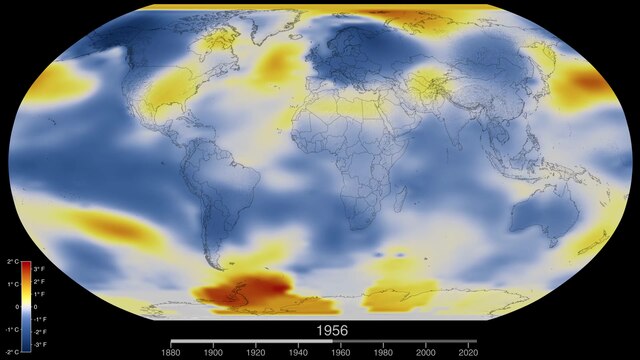
This color-coded map in Robinson projection displays a progression of changing global surface temperature anomalies. Normal temperatures are shown in white. Higher than normal temperatures are shown in red and lower than normal temperatures are shown in blue. Normal temperatures are calculated over the 30 year baseline period 1951-1980. The final frame represents the 5 year global temperature anomalies from 2017-2021. Scale in degrees Celsius.
Version 3 (data though 2020)
Original source page, titled "Global Temperature Anomalies from 1880 to 2020" Visualizations by Lori Perkins, includes the descriptions:
-
-
This color-coded map in Robinson projection displays a progression of changing global surface temperature anomalies. Normal temperatures are the average over the 30 year baseline period 1951-1980. Higher than normal temperatures are shown in red and lower than normal temperatures are shown in blue. The final frame represents the 5 year global temperature anomalies from 2016-2020. Scale in degrees Celsius.
-
NASA’s full surface temperature data set – and the complete methodology used to make the temperature calculation – are available at:
https://data.giss.nasa.gov/gistemp
Version 2 (data though 2019)
Original source page, titled "Global Temperature Anomalies from 1880 to 2019" Visualizations by Lori Perkins, includes the descriptions:
-
-
"This color-coded map in Robinson projection displays a progression of changing global surface temperature anomalies. Normal temperatures are the average over the 30 year baseline period 1951-1980. Higher than normal temperatures are shown in red and lower than normal temperatures are shown in blue. The final frame represents the 5 year global temperature anomalies from 2015-2019. Scale in degrees Celsius."
-
"These calculations produce the global average temperature deviations from the baseline period of 1951 to 1980."
-
"NASA’s full 2019 surface temperature data set and the complete methodology used for the temperature calculation and its uncertainties are available at:
https://data.giss.nasa.gov/gistemp
Version 1 (data through 2018)
Original source page, titled "Global Temperature Anomalies from 1880 to 2018", includes the descriptions:
-
-
"This color-coded map in Robinson projection displays a progression of changing global surface temperature anomalies from 1880 through 2018. Higher than normal temperatures are shown in red and lower then normal temperatures are shown in blue. The final frame represents the global temperatures 5-year averaged from 2014 through 2018. Scale in degree Celsius."
-
"These calculations produce the global average temperature deviations from the baseline period of 1951 to 1980."
-
"NASA’s full 2018 surface temperature data set — and the complete methodology used to make the temperature calculation — are available at:
https://data.giss.nasa.gov/gistemp
".
