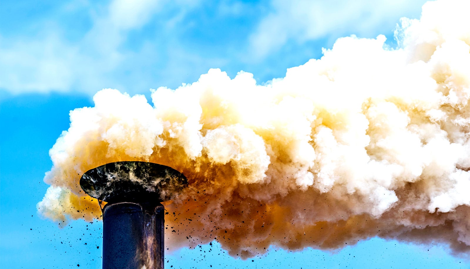
"We're used to seeing just large, increasing trends in pollution," Melanie Hammer says. But in China, "What we found, from 2011 to 2018, is that there actually is a particularly large negative trend." (Credit: Getty Images )
Map shows good and bad news on air pollution
A new global map shows trouble spots for air pollution containing tiny particles called at PM2.5 that can make their way deep into your respiratory system.
A new picture of the the state of the world’s air quality that reveals some surprises, both for better and for worse, researchers report.
Researchers used a harmonized approach, incorporating data from multiple satellites and ground monitors with computer modeling to compile a comprehensive, consistent map of pollution across the globe . The new data spans 1998-2018.
Results of their study, which looked tiny particles called at PM2.5 that can make their way deep into a person’s respiratory system, appear in Environmental Science & Technology .
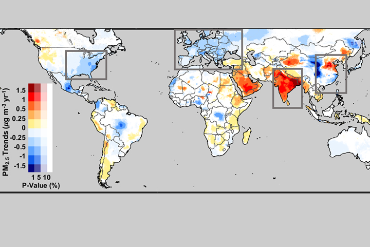
PM2.5 around the world
“Prior studies that look at long-term PM2.5 haven’t used data as recent as we have,” says Melanie Hammer, a postdoctoral research fellow in the lab of Randall Martin, professor of energy, environmental, and chemical engineering in the McKelvey School of Engineering at Washington University in St. Louis. Older data can’t capture the results of many programs aimed at curbing pollution—even if they have been in effect for nearly a decade.
That turned out to be the case in China, where a significant drop in pollution in the recent past was the result of strategies begun in earnest around 2011. Other data sets don’t capture the drop.
“The data [the] analysis reveals is a real success story for air quality controls. It shows they can be remarkably effective at reducing PM2.5.”
In India—another area of concern—the story was not as positive. “It seems there’s a bit of a plateau of PM2.5 levels,” Hammer says. Though still, levels are not rising as steeply as other reports may suggest.
PM2.5 refers to the size of particles—2.5 microns. These tiny particles are created in nature, but also by human activities, including some manufacturing processes, car exhaust , and the use of wood-burning cookstoves.
In people already sick with illness such as asthma , PM2.5 can have immediate health consequences. Long-term, however, breathing in these particles carries consequences for everyone.
“PM2.5 is a major public health concern globally,” says Hammer. “It’s important to get accurate exposure estimates to estimate health impacts.”
Making the map
It’s not easy to measure the amount of PM2.5 on the ground because there isn’t any kind of comprehensive monitoring network covering the globe. North America and Europe have extensive monitoring systems, as does China. But, Martin says, “There are large gaps in ground-based monitoring. People can be living hundreds of kilometers away from monitors.”
To develop a comprehensive pollution map, then, ground-based monitors are simply insufficient.
To capture a global snapshot, Martin’s team started with satellite images of columns of atmosphere that spanned the ground to the edge of space. Using the established GEOS-Chem model, which simulates atmospheric composition, they could infer how much PM2.5 should be on the ground, at the bottom of any given column.
When comparing the predictions to actual levels measured by ground monitors, the agreement was striking. In fact, Martin says, “It’s the best level of agreement found to date.”
But the researchers still went a step further.
The agreement was great, but not perfect. So Hammer added the differences between the observed and predicted amounts of PM2.5 and expanded the ground-based predictions across the globe, filling in the massive gaps between monitors.
This extra step brought the observed and predicted levels of PM2.5 from 81% to 90% agreement.
Once they were able to take a good look at the most recent pollution levels around the world, the researchers saw some stark changes from previous trends. Particularly in China.
“We’re used to seeing just large, increasing trends in pollution,” Hammer says. But in China, “What we found, from 2011 to 2018, is that there actually is a particularly large negative trend.”
Elsewhere in Asia, the picture wasn’t as positive.
While pollution levels did not seem to be increasing in India, the country seems to be in a plateau phase. “The broad plateau of very high concentrations, to which a large population is exposed, is quite concerning,” Martin says. “It affects the health of a billion people.”
However, the takeaway from this research can be, on the balance, a hopeful one: It seems to show one possible way forward.
“The data Melanie’s analysis reveals is a real success story for air quality controls,” Martin says. “It shows they can be remarkably effective at reducing PM2.5.” Although scientists have known these controls contain the potential to make an impact, he says, “The changes in China are very dramatic, larger than we have seen anywhere in the world over the observational record.
“It illustrates a real opportunity to improve air quality through effective controls.”
Support for this work came from the Natural Sciences and Engineering Research Council, the Energy Policy Institute at the University of Chicago, and the Health Effects Institute, and the Killam Trusts. The researchers obtained GEOS-Chem input files from the GEOS-Chem Data Portal enabled by Compute Canada.
Source: Washington University in St. Louis
The post Map shows good and bad news on air pollution appeared first on Futurity .
Share this article:
This article uses material from the Futurity article, and is licenced under a CC BY-SA 4.0 International License. Images, videos and audio are available under their respective licenses.
Related Articles:

Check the map for your county’s traffic-asthma link
April 8, 2019 • futurity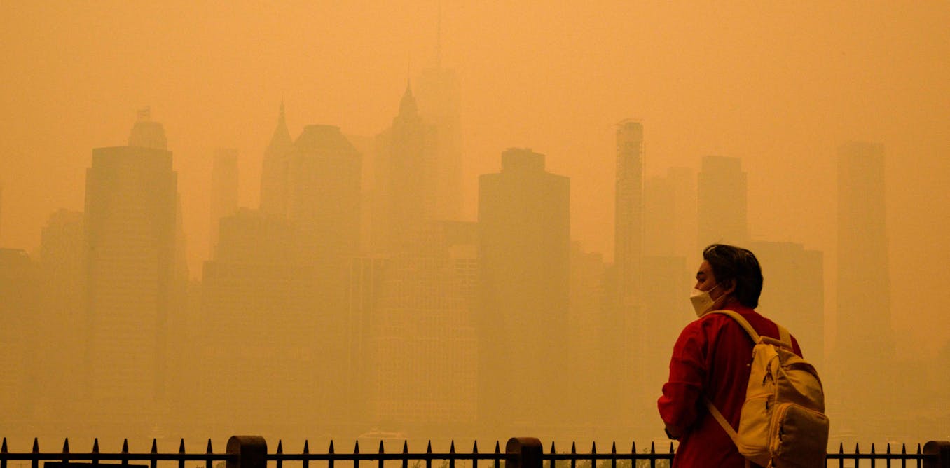
Wildfire smoke and dirty air are also climate change problems: Solutions for a world on fire
June 14, 2023 • conversationLinks/images:
- https://www.futurity.org/most-polluted-city-monitoring-2135352/
- https://doi.org/10.1021/acs.est.0c01764
- https://www.futurity.org/auto-emissions-ultrafine-particles-2273422/
- https://www.futurity.org/asthma-risk-kids-air-pollution-2128892-2/
- https://source.wustl.edu/2020/06/global-pollution-estimates-reveal-surprises-opportunity/
- https://www.futurity.org/air-pollution-map-pm2-5-2395292/
- https://www.futurity.org