Timeline._Overdose_death_rates_involving_opioids,_by_type,_United_States.gif

Size of this preview:
800 × 473 pixels
.
Other resolutions:
320 × 189 pixels
|
640 × 379 pixels
|
1,024 × 606 pixels
|
1,280 × 757 pixels
|
2,560 × 1,515 pixels
|
5,379 × 3,183 pixels
.

|
This
chart
image could be re-created
using
vector graphics
as an
SVG
file
. This has several advantages; see
Commons:Media for cleanup
for more information. If an SVG form of this image is available, please upload it and afterwards replace this template with
{{

vector version available

|

new image name

}}
.
It is recommended to name the SVG file “Timeline. Overdose death rates involving opioids, by type, United States.svg”—then the template Vector version available (or Vva ) does not need the new image name parameter. |
Summary
| Description |
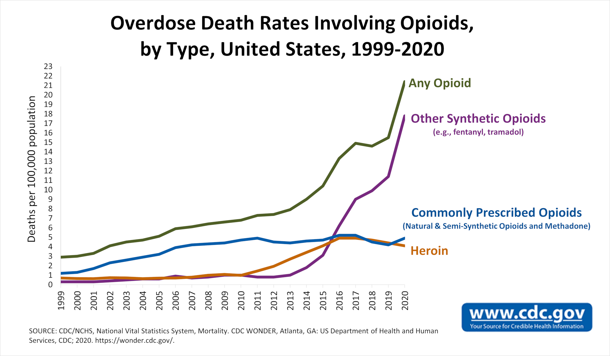
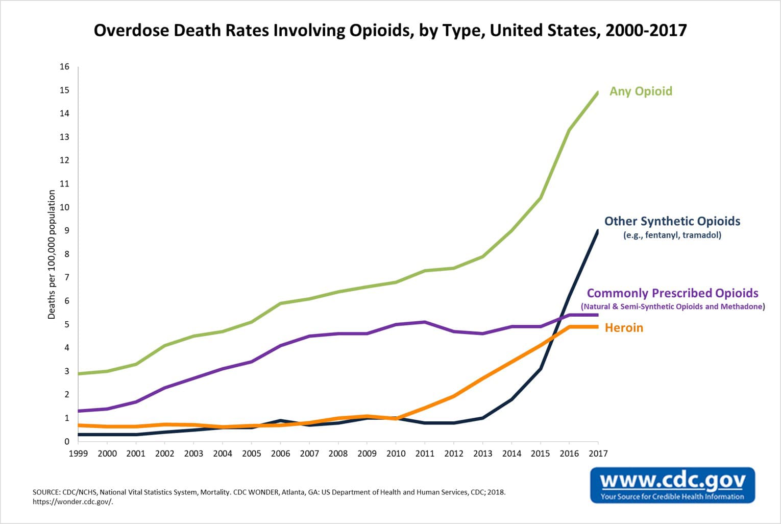
English:
Timeline graph of
overdose death rates involving opioids
, United States. Deaths per 100,000 population.
|
| Date | - Date the chart was first uploaded to the Commons. See file history for dates of later uploads. |
| Source | Opioid Data Analysis and Resources. CDC . Scroll down to "Trends in Death Rates" section. 1999-2020 chart . 1999-2019 chart . 1999-2018 chart . 2000-2017 chart . 2000-2016 chart . |
| Author | Centers for Disease Control and Prevention . On some versions the chart was cropped by User:Timeshifter . Freeware IrfanView was used to add a border, and to edit the caption text on the chart. |
| Other versions |
See:
|
Licensing
|
|
This image is a work of the
Centers for Disease Control and Prevention
, part of the
United States Department of Health and Human Services
, taken or made as part of an employee's official duties. As a work of the
U.S. federal government
, the image is in the
public domain
.
|
|